Start Trading Now
Sign up for ZitaPlus, where knowledge and personalized support come together for your success.
Open Real Account Open Demo Account
Out of all the technical tools sitting on modern charting platforms, the Relative Strength Index remains a core staple for traders. Created back in 1978 by J. Welles Wilder Jr., this handy momentum tool measures how fast and how hard price is moving. While many technical indicators get cluttered or messy when the market turns on a dime, the RSI keeps things clean by scaling price action into a neat bounded oscillator from 0 to 100.
Getting comfortable with reading RSI gives you a solid edge when timing your trade entries. Far beyond those generic overbought and oversold levels that basic guides preach, this tool reveals quiet momentum divergences, failure swings, and hidden continuation patterns across practically any market you trade.
Stripping away the technical jargon, the Relative Strength Index checks whether buyers or sellers are driving the market. It does this by comparing the size of an asset's recent green candles directly against its recent red candles over a specific window of time.
Because the math pins the oscillator between 0 and 100, you get instant context on current price velocity. When price zooms up with barely any pull-backs, the line climbs fast. When heavy selling takes over, the line drops down toward zero.
To make sense of the squiggly line on your screen, keep these three default parameters in mind:
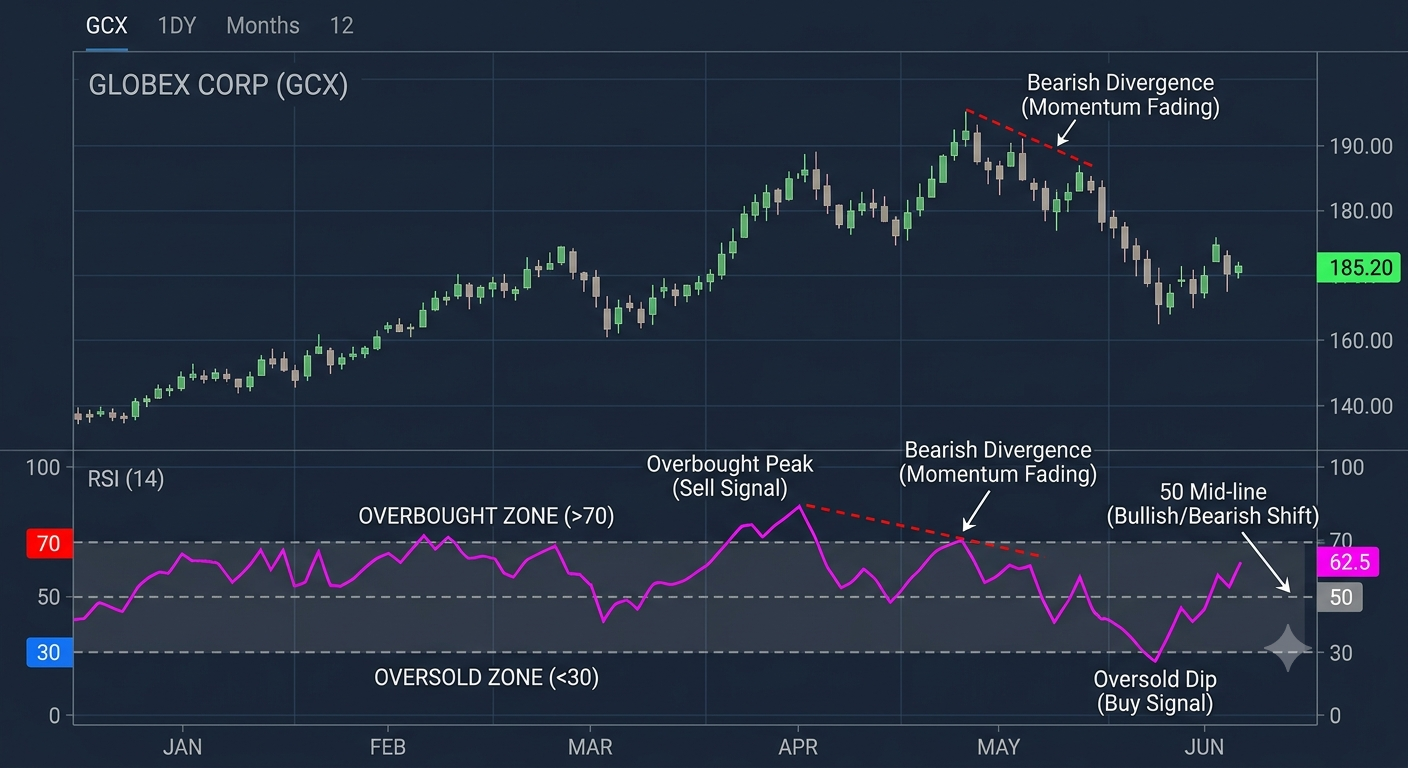
Your charting platform does the heavy lifting instantly, but breaking down the actual math shows why the indicator responds the way it does when markets get chaotic.
The formula works in two basic steps: calculating the Relative Strength (RS) ratio first, and then converting that number into a readable index score between 0 and 100.
RS = Average Gain / Average Loss
RSI = 100 - (100 / 1 + RS)
For the very first 14 bars on your chart, the Average Gain is just the sum of gains divided by 14, and Average Loss is the sum of losses divided by 14. After that baseline is set, Wilder used a smoothed moving average approach to keep the line from jumping around wildly:
Average Gain = (Previous Average Gain x 13) + Current Gain / 14
Average Loss = (Previous Average Loss x 13) + Current Loss / 14
| Component | Default Value | Market Function |
| Lookback ($n$) | 14 periods | The number of bars checked to tally up gains vs losses |
| Center Line | 50.0 | The dividing line where bullish and bearish momentum trade places |
| Overbought Level | 70.0 | Upper zone where upward momentum is getting intense |
| Oversold Level | 30.0 | Lower zone where downward momentum is getting heavy |
Tweak that standard 14-period setting, and the indicator behaves quite differently. Drop it down to a 9-period lookback, and the line becomes jittery, crossing 70 and 30 all the time. That can give quick scalp setups for day trading, but it definitely brings plenty of false alarms along for the ride.
If you stretch the lookback out to 21 or 25, the oscillator smooths out dramatically. Swing traders and position traders like these longer settings because they help you stay in big moves without getting scared off by minor intraday noise.
While beginner traders can fall into the trap of blindly buying every time the line dips under 30 and shorting above 70, experienced traders look for structural chart patterns that offer much better odds.
A divergence happens when price and momentum stop agreeing with each other. It is usually one of the first warning signs that a trend is running on fumes.
A regular bullish divergence shows up when price falls to a lower low, but the RSI line forms a higher low. That tells you that even though price is dropping, the selling speed is actually slowing down. A regular bearish divergence happens when price hits a higher high, but the RSI line tops out at a lower high, proving that buyers are losing steam despite those higher price tags.
While regular divergences signal that a reversal is brewing, hidden divergences tell you that the main trend is alive and well, just taking a quick breather.
Wilder loved failure swings because they don't care what raw price is doing; they rely purely on how the oscillator line behaves around key levels.
A bullish failure swing starts when RSI drops below 30, bounces back over 30, dips again while staying safely above 30, and then breaks its previous bounce peak. That break of the peak gives you a prompt buy signal, even if the price chart itself hasn't finished making a clean bottom yet.
Traders who stay in the game long term rarely trade RSI in a vacuum. Instead, they blend momentum readings with market structure to construct repeatable setups.
Think of the 50 line as the midline switch. When RSI climbs above 50, average gains are officially outpacing average losses over the last 14 bars, marking a clear shift toward buyer control.
In a healthy uptrend, brief dips that bounce right off that 50 mark give you low-risk places to get long. Buying as RSI reclaims 50 from below lets you catch fresh momentum right as it starts turning back up. Just tuck your stop loss below the recent price swing low.
In choppy, sideways markets where price keeps bouncing back and forth between obvious support and resistance walls, extreme momentum readings turn into great timing tools.
Wait for price to test known support while RSI drops below 30. Instead of rushing in while price is actively falling, wait for the line to cross back over 30 to confirm that buyers are stepping in to defend the level. Your main target is the top of the range, with a stop loss just under support.
When a trend gets really strong, those traditional 70 and 30 boundaries shift. During a monster bull run, RSI rarely drops below 40, usually spending its time swinging between 40 and 80. In a deep bear market, RSI struggles to get past 60, bouncing between 20 and 60 instead.
Noticing these shifted ranges saves you from shorting strong rallies just because RSI touched 70. Instead, treat the 40 to 50 zone as dynamic support during bull trends, using pull-backs into that pocket to search for cheap long entries.
If you don't match your RSI strategy with what the broader market is doing, you can run into trouble quickly. Keep these common traps on your radar:
To get cleaner entries, layer RSI alongside other trading tools that track trend direction, volume, or key levels.
Pairing RSI with a 200-day simple moving average gives you an easy trend filter. Only take bullish RSI setups when price is trading above the 200-day SMA, and stick to bearish setups when price stays below it. This single rule stops you from getting caught on the wrong side of the market.
Adding MACD right next to your RSI setup brings extra momentum confirmation. When RSI crosses above its 50 midline at the exact same moment MACD prints a bullish signal line cross, your trade conviction goes up a lot. Throwing volume spikes into the mix gives you that final layer of proof before taking the trade.
What is the Stochastic RSI and how is it different from standard RSI?
Stochastic RSI is an indicator of an indicator. While standard RSI tracks price change directly, Stochastic RSI applies the Stochastic Oscillator formula to RSI values instead of price. This makes it far more sensitive to minor swings, helping short-term traders catch momentum pivots much faster than standard RSI can detect them.
What is Connors RSI (CRSI)?
Connors RSI is a 3-part hybrid momentum indicator developed by Larry Connors. It combines short-term 3-period RSI, a Streak RSI (measuring the number of consecutive up or down days), and a Rate of Change percentile rank. This combination smooths out traditional RSI signals to improve win rates for short-term mean-reversion strategies.
Can RSI be negative or go above 100?
No. Due to its mathematical design, RSI is strictly bounded as an index between 0 and 100. Even during market crashes or unprecedented rallies, the formula scales all price gains and losses within this fixed range, making it visually consistent across all market conditions.
How does RSI behave on logarithmic charts versus linear charts?
RSI relies on relative percentage gains and losses rather than absolute dollar changes. Because of this percentage-based math, its readings remain identical whether you view a stock on a logarithmic price chart or a linear price chart.
Why is RSI sometimes called a "lagging" indicator?
RSI uses historical price bars (14 periods by default) to calculate average gains and losses. Because it relies on past price action to print its current value, the line inevitably lags behind sudden real-time price shocks until the new price data updates the underlying formula.
Would like to learn how to look financial markets from a different angle? Then keep reading and invest yourself with ZitaPlus.